Piet Zwart
Piet Zwart (1885-1977) was a pivotal figure in 20th-century Dutch design, renowned simultaneously as a photographer, typographer, and industrial designer. Operating during the fertile period between World War I and World War II, Zwart rejected the ornamental complexity of earlier graphic traditions. He aligned himself instead with the functional imperatives of Dutch modernism, particularly the structural purity advocated by the De Stijl movement, though he maintained professional independence from formal associations. His approach was intensely practical yet formally rigorous, prioritizing clarity and efficiency in commercial communication.
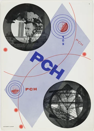
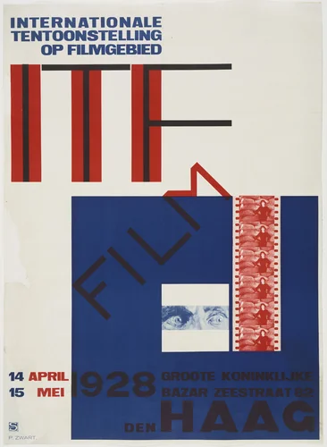
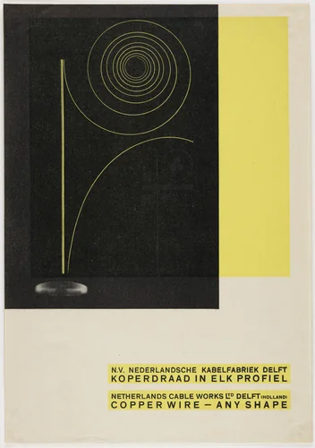
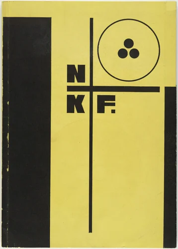
Zwart’s most influential output occurred during a remarkably short but focused span, approximately 1922 to 1925, during which he produced around fifteen designs that redefined commercial art. He treated the printed page not as a decorative field but as an architectural space to be logically structured. Zwart pioneered the use of prefabricated elements, standard sans-serif typefaces, primary colors, and stark geometric asymmetry, revolutionizing the existing methods of composition. This technique is powerfully evident in pieces such as his dynamic Advertisement for NKF electrical cables and the iconic Poster for the rubber flooring manufacturer LAGA. His strategic integration of emerging photography alongside text, often utilizing diagonal compositions, set a new standard for modern corporate identity.
Many of Zwart’s commissions involved technical or industrial subjects, including detailed advertisements for Vickers House in The Hague or local institutions like the Housing Rental Office (Verloop Woning Bureau). Yet, Zwart possessed the subtle ability to distill complex information into its essence, often injecting a palpable sense of playful precision into these otherwise dry subjects. A defining example of this concise wit is the simple yet striking layout for Nutter Uit Noten Bereid (Butter Made from Nuts). This combination of stringent technical layout and conceptual elegance earned him the self-chosen moniker of "typographic designer" rather than simply "typographer," underscoring his holistic, interdisciplinary view of the medium.
Though his dedicated period in commercial graphic design was brief, Zwart's visual philosophy had a profound and lasting impact on European modernism. His works, recognized for their seminal contribution, are preserved in major public institutions, including the collection of the Museum of Modern Art. Today, the foundational authority and crisp geometry of Zwart’s early modern designs remain highly influential, and many of these powerful Piet Zwart prints are accessible as high-quality prints for study and appreciation.
Source: Wikipedia · CC BY-SA 4.0